Home screen
Overview
Wildcard began as an app web browser. It turned web pages into consolidated card formats for easier consumption on mobile devices. In 2013, surfing the web on mobile browsers required prolonged loading time because webpages weren’t optimized for phones. Removing large assets like CSS, ads, and other media that would flood the download queue; it allowed users to have a faster, more fluid web browsing experience.
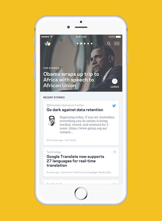
In 2015, Khoi Vinh, Design Chair at Wildcard, helped the app pivot from web browser to a news aggregator. The team limited the content in the app to news and media which benefited the most from the card view. Wildcard created an in-house editorial team to scan the web for the latest news and surface the content on the app in a way where users can either skim or dive deeper into each story. The app became #1 App of the Week and one of Apple’s Best Apps of 2015.
I joined Wildcard in October 2015, after Wildcard 2.0 launched as a news aggregator.
Role
As a Product Designer, I was tasked with UX/UI, wireframes, user research, user testing, and prototyping.
The Team: Lead Designer, Project Manager, iOS Developer, Android Developer, Front-end Developers, and Backend Developers
Stakeholders: Founder, Co-Founders, Design Chair, and Data Scientists
Defining the Problem
When Wildcard 2.0 launched as a news aggregator, it received around 90K installs. Retention soon revealed to be a problem, the app would lose almost 90% of its users within 30 days after the initial download. It’s a common problem with apps, as stated by Andrew Chen here.

My job was to work with the lead designer to understand where the app was falling short with the users and to come up with solutions that would minimize the gap between short term usage and long term usage.
Research and Discovery
We reached out to old and new users to understand how they were using the app.

Multiple users said they only opened the app once or twice a day, during one of those interviews one user said: “The top image slideshow makes it seem like nothing has changed.”
This revealed that the existing structure doesn't make it feel like the app updates frequently. New articles are populated under the slideshow and articles related to the top stories are accessed by revisiting the top story in the slideshow.
When asked about their news reading habits one user said: “I normally use another RSS reader like FlipBook because I get to see what I like.”
When asked how the app could be improved one user said: “I wished there was a way to hide what (news topics) I don’t want to see.”
Customization of the feed was also something users were interested in. The version available at the time only allowed users to share the news articles.
Constraints
The news feed was collected, curated, and uploaded through the backend by in-house Wildcard editors. This created a bottleneck for the frequency of news article updates in the app. Another challenge for the editors was to keep the feed as neutral as possible. Fake news and siloed opinions were beginning to take hold on social media, and the integrity of a curated newsfeed was questioned by the users. One of the big challenges for the design solution was how to allow users to personalize what they see within our current infrastructure without creating an echo chamber.
Goals:
Surface more content to users in an interesting way while working with existing content creation workflow.
Introduce and explore content personalization while considering technical debt.
Solutions and Deliverables
Topic Targets
While working with the existing infrastructure we created a feature called the Topic Targets to help surface more content and optimized the workflow for the editorial team. I did some contextual inquiry by sitting with the editors to see how they worked together and separately. There were 5 editors and they each had the ability to collect and push content to the app. Often topics overlap and there wasn’t clear visibility within the team to see who was covering what. That often leads to a lot of back and forth verbally and lost time by double posting within the team. By introducing the topic targets, the editor in chief can assign or recommend a topic that should be covered that day and see what has been already pushed to the app that is related to the target.
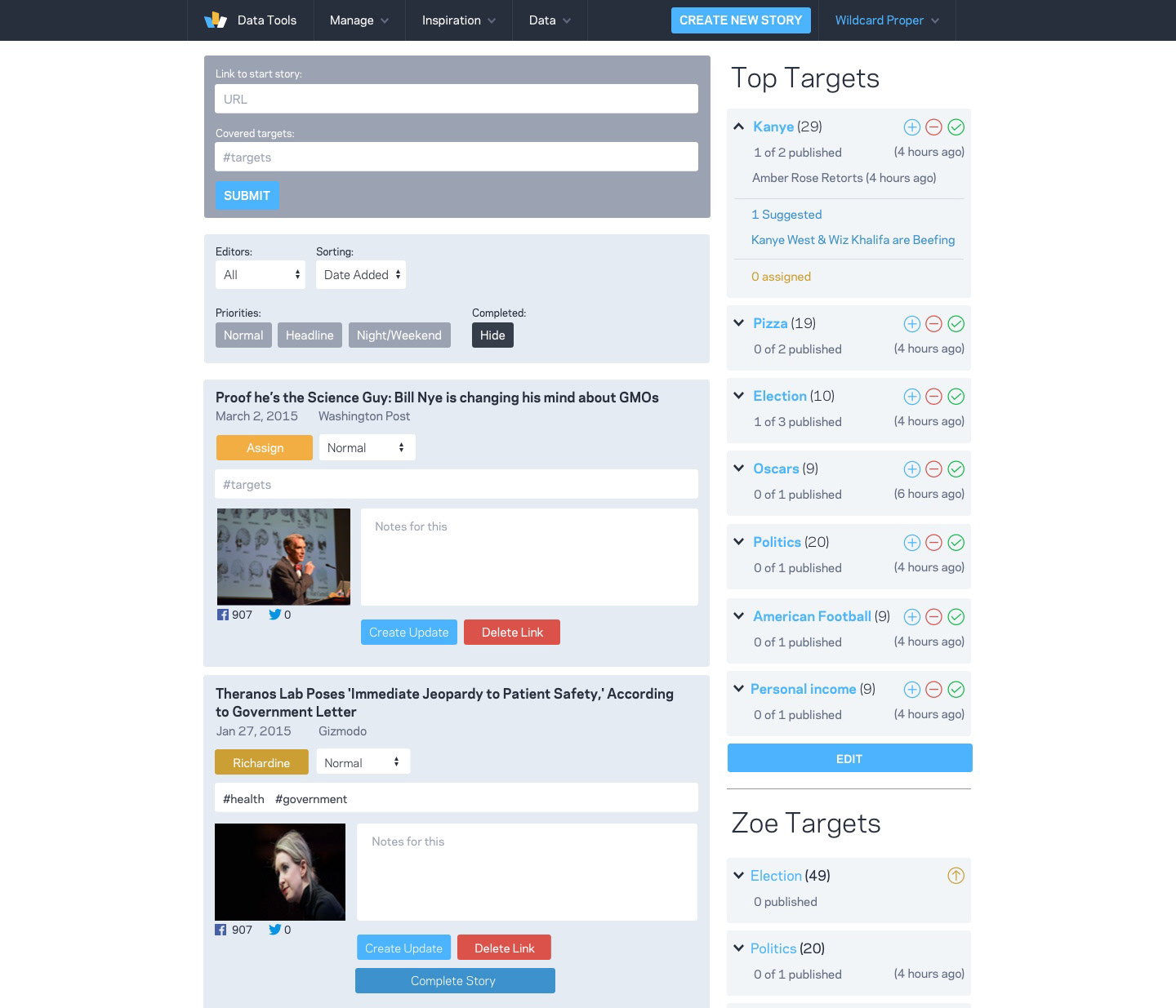
Topic target list and card series
Card Swiping
The first step we took for personalization was adding another layer of interaction to the existing news cards. The previous version of the cards allowed users to save the card for later by swiping right or share the card by swiping left, by adding the ability to remove the cards users can hide what they do not wish to see. We went with this approach because it worked with the existing flows and it allowed us to also start saving data on what the users likes and dislikes as a first step to further help personalize their feed.
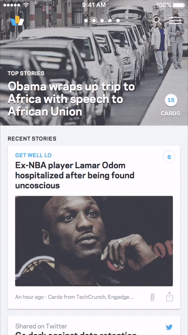
Card interaction
Zoe- News assistant with machine learning
With the rise of machine learning and virtual assistants, Wildcard decided to use their data scientists and engineers to explore the idea of creating an assistant for news. This attempt was not only to do something potentially groundbreaking, but it might also potentially solve personalization for users, surface more content, and increase engagement overall.
We created a v.1 of Zoe using personalization through a series of surveys created by editors and allowing the answers selected by users to connect to various topic tags. These then will populate more or fewer news articles on a user’s feed.
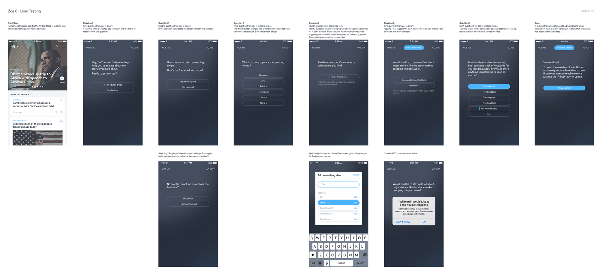
Example of an in app survey flow

Survey creator tool for the backend
Retrospective
What went well
Wildcard was my first startup. I had the privilege to work with and learn from some of the most brilliant engineers and designers in the industry. I added many skills to my design tool belt and I was able to merge UX with my visual design background in a work environment. I learned a lot about startup culture and the work needed to make a good app.
What didn't go well
Unfortunately, the runway for the product was cut short by their investors and the company folded. The product lacked clear growth goals, pivoting from a native web browser to a news aggregator left too many open issues for the app to retain traction with users and convince stakeholders of its value. In the end, it is all about timing. The features and marketing strategies that could’ve pushed sooner to help the app move further along.