Overview
CourseHorse is an online marketplace that allows individuals to discover and book classes. Prospective students can browse professional courses from traditional schools or casual programs from local businesses.
When I joined CourseHorse in 2016, they had just completed a series B raise. With the funding, they wanted to redesign their site and consider other ways to increase business revenue. The CourseHorse website had the same styles from when they won the NYU New Venture Business Plan Competition in 2011. The outdated interface had clunky elements and awkward flows that prevent prospective students’ ability to convert.
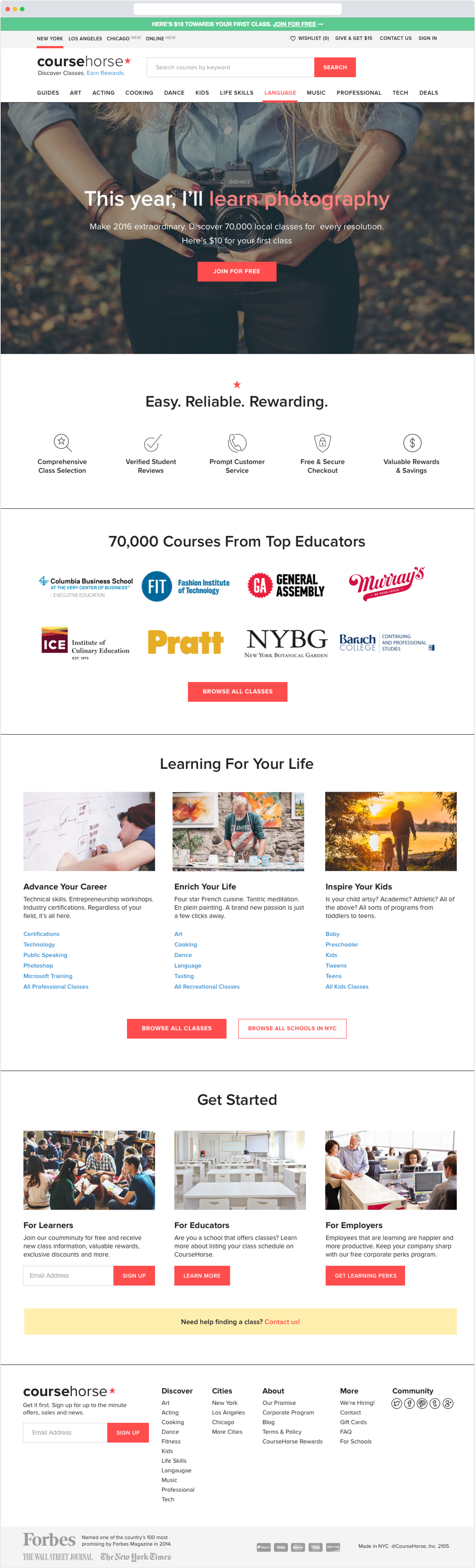
Redesigned home page
Role
As Lead Product Designer, I was tasked with exploring solutions to improve student conversions and increase return on investment (ROI).
Team: Product Manager, Full stack engineers, and QA
Stakeholders: Marketing, Customer Service, Content Strategist, Sales, Operations, Account Manager, and Co-Founders
Understanding the Problem
To kick off the redesign process we spoke to some users to get feedback and audit the old site. We decided to test on a new user’s journey because it had phases that overlapped with a returning user with fewer biases.
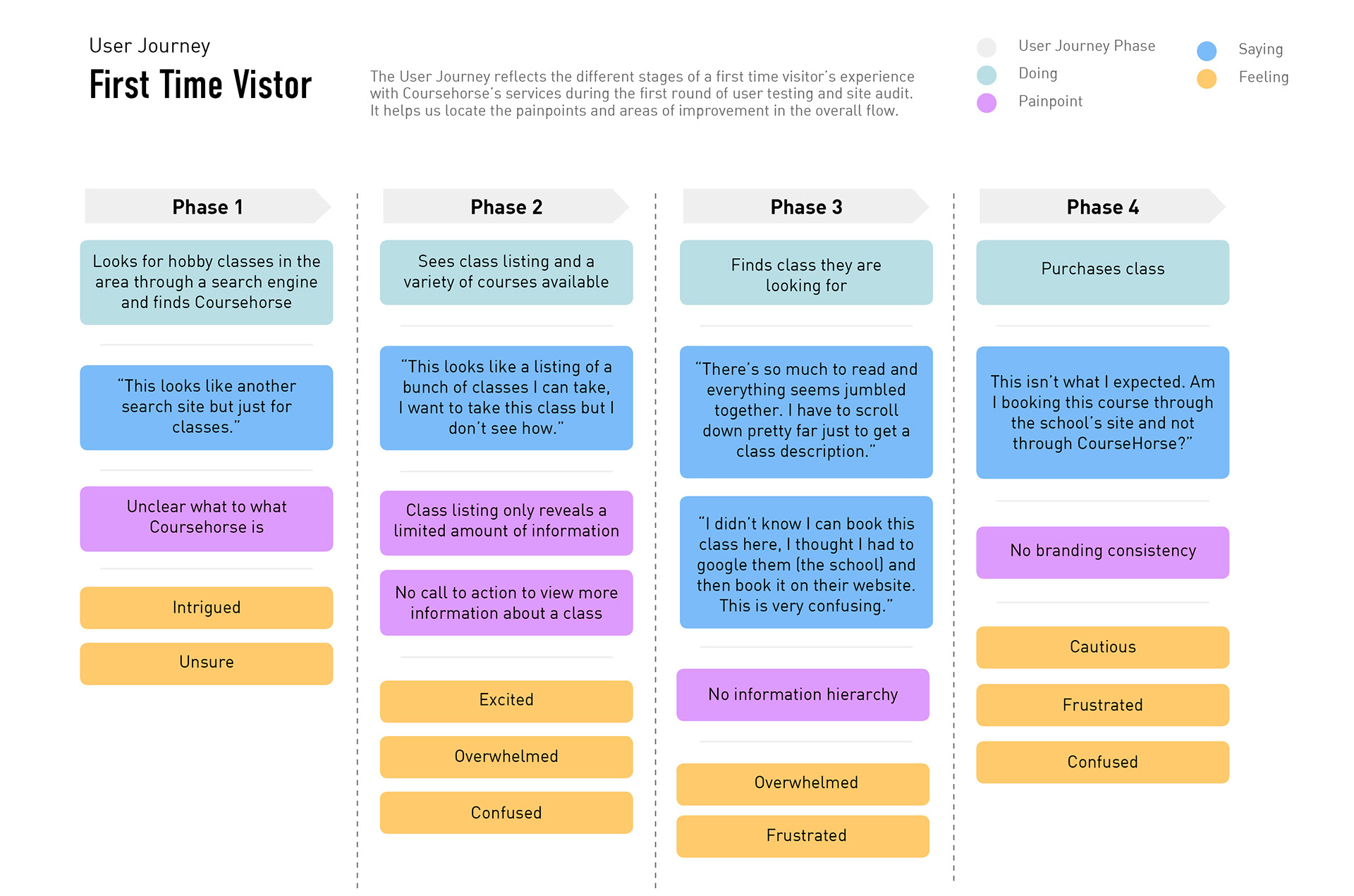
One comment that kept resurfacing was some users said that the site felt outdated and untrustworthy.
Previous design
The conversion from mobile visits was 0.1% and the drop off rates was also incredibly high. This was a difficult spot to be in, CourseHorse relied heavily on their email marketing strategies and Google Adwords both of which most visitors enter via their mobile devices.
After speaking with users, it became clear the mobile site had some issues. Mainly, the images were small and class listings didn’t surface important details that would encourage prospective students to sign up for a class. The site had a lot of information, but no definitive visual hierarchy.
Old mobile browse page
Design solutions and limitations
Desktop
For the redesign, we wanted to focus on moving the website to a code base that would be easier to maintain. The engineering team decided to refactor the existing code to resolve some of the major bugs and integrate the Semantic UI framework.
While working with semantic elements, I adjusted the style with a refreshed color scheme and other user interface tweaks. These changes pushed the site in the direction of feeling more modern and trustworthy. When we tested the changes on new Coursehorse users, many of them shared that they like the site, but more importantly, they would purchase a class through it.
The redesign also allowed us to address outstanding issues, such as adding an “attend” button on the Class Listings Page. We also broke the checkout process into smaller steps to avoid overwhelming the user.
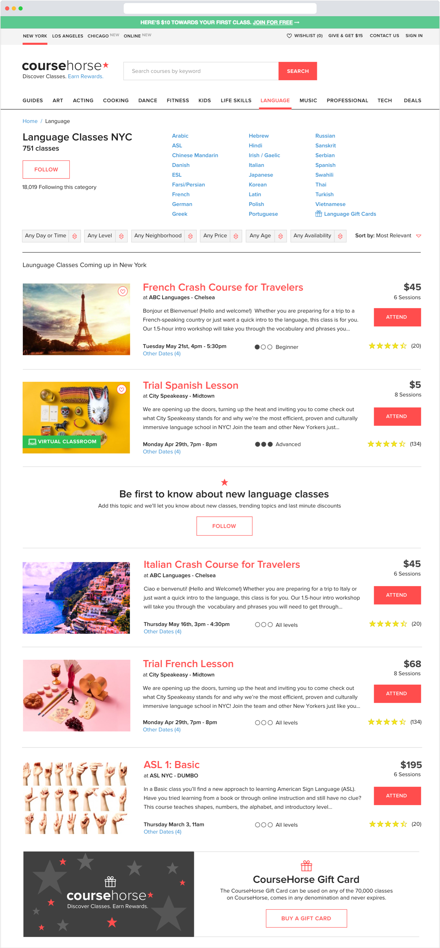
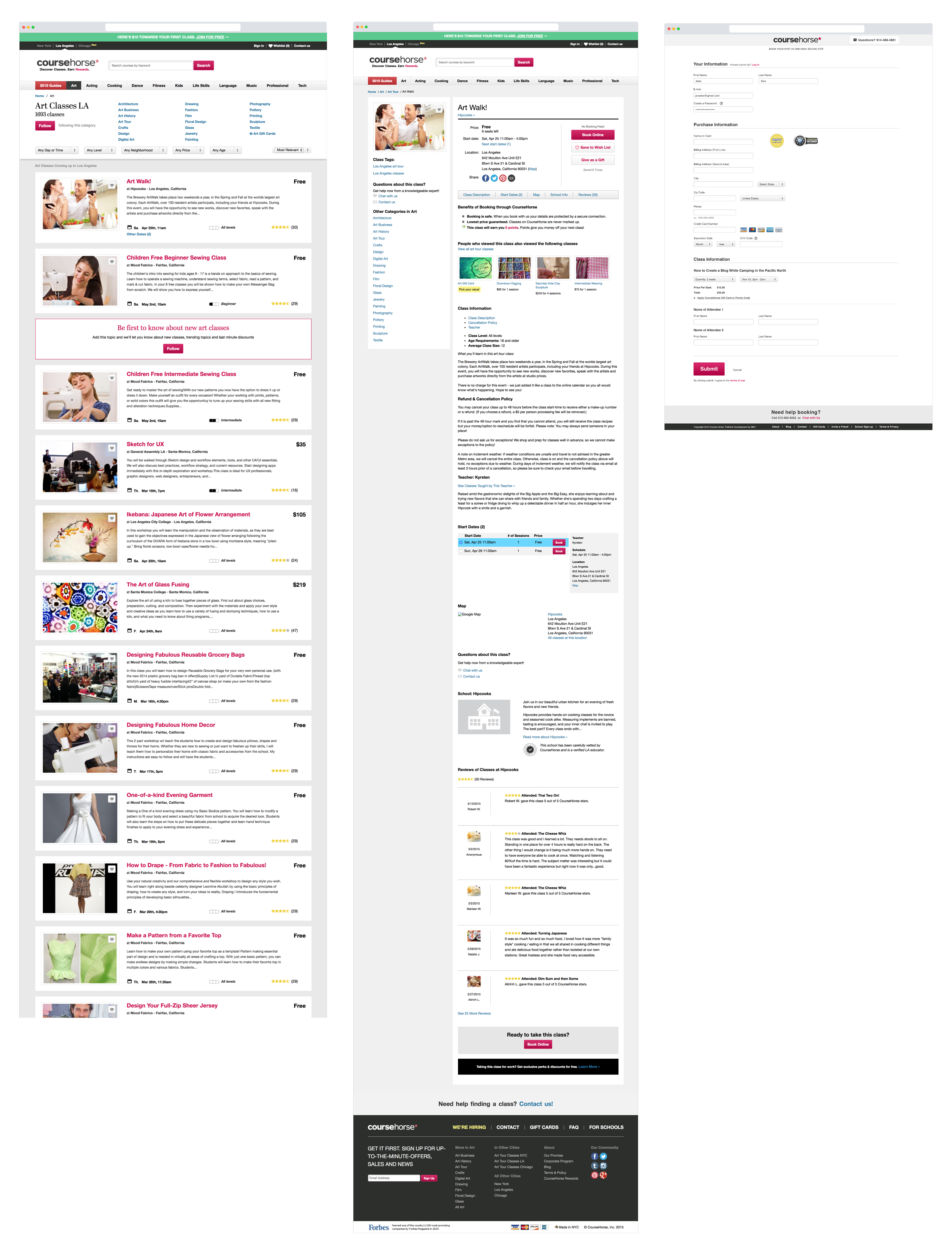
Redesigned course browse page
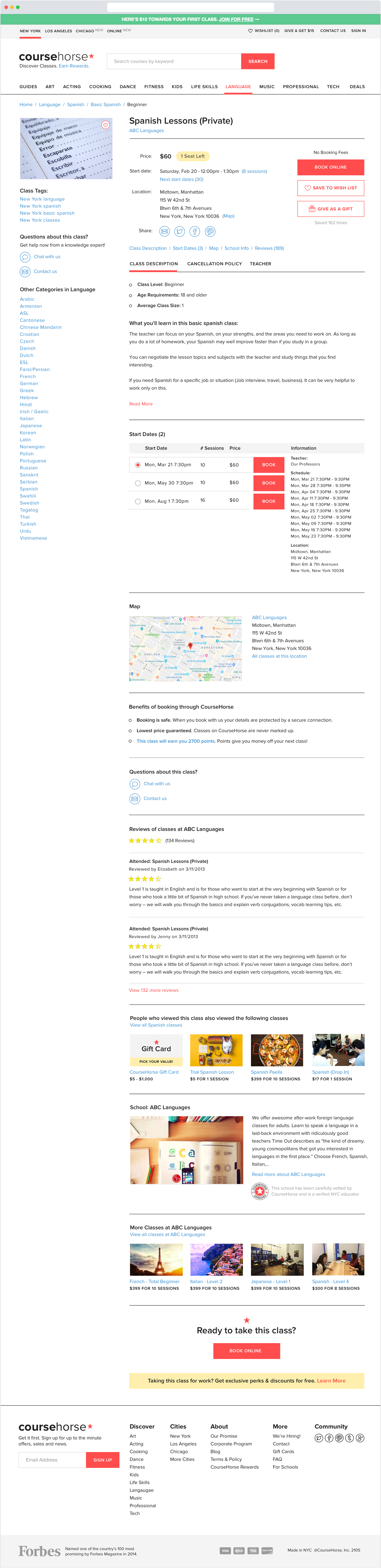
Redesigned class details page
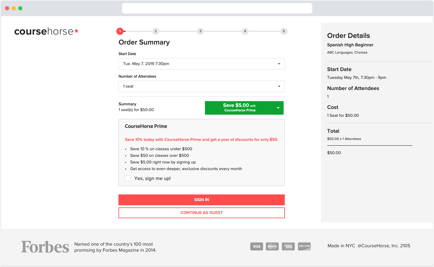
Redesigned checkout flow
Mobile
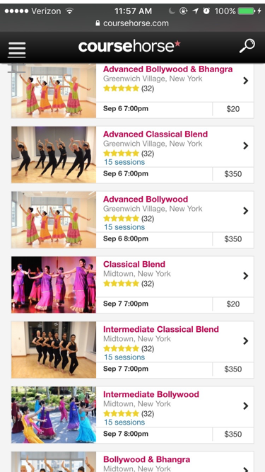
The mobile version was originally built using adaptive design principles. However, with the new influx of portable device, CourseHorse wanted a responsive site. After releasing the desktop redesign to a selected number of users in a two-tailed A/B test, I began redesigning the mobile site as well.
The mobile site was a clean slate which gave us more flexibility to test out smaller features. I decided to test out collapsible sections and a PayPal button on the Course Detail Page. I also added larger photos to the Course Listings Page to attract a more tech-savvy demographic. Finally, we also added a search that included extensive filters and worked better with Apache Solr (an open-source enterprise search platform). These additions helped the mobile site experience feel more like that of a native app’s.
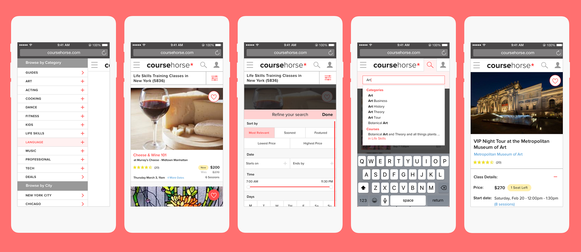
Mobile redesign
Second Round of Testing
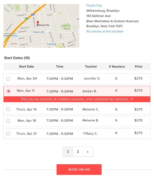
We scheduled a second round of testing, during which we realized that some of the newer UI elements were unclear. For example, prospective students didn’t realize they could select different start dates. They also didn’t realize that some classes had multiple sessions on different days.
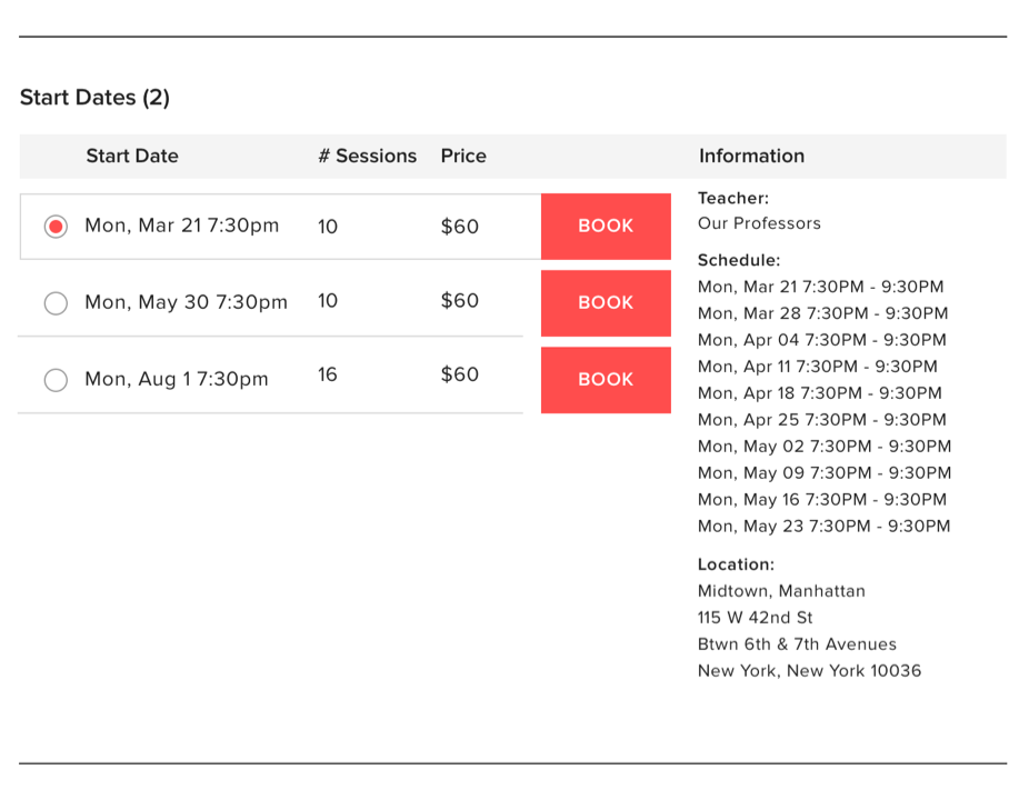
During one of the sessions, a user said: "There are multiple dates listed in the schedule, what day does this class start on?"
To simplify this, the schedule selector was separated into two parts.
The map was also combined with the section to reduce the amount of repeated and to provide a sense of hierarchy.
Collapsed view of schedule selector
Expanded view of schedule selector
Results
What went well
Two weeks after the mobile redesign was released, our google analytics revealed mobile conversion increased by 31%.
I learned a lot as a Lead Product Designer, working in a lean process was a nice change from the waterfall and agile processes I worked with before. I was able to flex my design skills and had to adapt quickly as a sole designer juggling multiple engineering streams.
What didn't go well
Writing mobile in React wasn’t sustainable when there was only one engineer in the team that knew how to use and maintain it. When the react engineer team left, the team had to scrap most of the mobile site and rebuild it in a language they all knew.
The redesign did not increase conversion on the desktop when it launched. There were fewer drop-offs on the site, but converting users to purchase remained the same. Although users were purchasing more on the mobile site it was not enough to see a big change in overall profits. In hindsight, we should’ve ran the test for a few more weeks. When the redesign was launched it was right around the time of the election results of 2016 which was a variable that was overlooked. Based on those results, the founders decided to redirect their efforts to expanding CourseHorse to more cities instead of furthering improvements to the site.